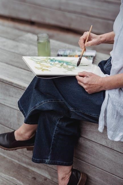
Watercolor painting offers a uniquely expressive medium, celebrated for its luminous qualities and fluid nature. This art form,
accessible to all skill levels, invites exploration and creativity through simple techniques and readily available materials.
Beginners will find joy in mastering basic washes and color blending, while experienced artists can delve into complex layering
and textural effects. Discover the captivating world of watercolor, where water and pigment dance together to create breathtaking
artworks, and embark on a journey of artistic discovery, guided by online resources and inspiring tutorials. Embrace the freedom
and spontaneity that watercolor provides, and unlock your artistic potential with each brushstroke, creating stunning visuals.
What is Watercolor?
Watercolor is a transparent painting medium where pigments are suspended in a water-based solution. Unlike opaque paints like oil or acrylic, watercolor allows light to reflect off the white of the paper, creating a luminous and delicate effect. This transparency is key to its unique characteristics, influencing layering techniques and color mixing. Historically, watercolor has been used for botanical illustrations, landscapes, and sketches due to its portability and ability to capture subtle details.
The beauty of watercolor lies in its unpredictable nature; the way the water interacts with the pigment and paper creates organic textures and blends. Mastering control over water flow is crucial, as it dictates how the paint spreads and settles. Different types of watercolor paints exist – pans, tubes, and liquid watercolors – each offering varying levels of pigment concentration and convenience. Ultimately, watercolor is a versatile medium that rewards experimentation and patience, allowing artists to express their vision with fluidity and grace.
Materials You’ll Need
To begin your watercolor journey, gather essential supplies. Watercolor paints are available in pans (convenient for beginners) or tubes (offering richer pigment). A selection of watercolor brushes – round, flat, and detail brushes – will provide versatility. Invest in watercolor paper; its weight (140lb/300gsm is recommended) prevents buckling when wet. A palette for mixing colors is crucial, alongside two water containers (one for clean water, one for rinsing brushes).
Other helpful items include masking tape to secure paper, a pencil for sketching, an eraser, paper towels for blotting, and a spray bottle for re-wetting paints. Consider masking fluid for preserving white areas. While a basic set is sufficient to start, exploring different brands and qualities of materials will enhance your experience and allow for greater artistic expression. Don’t be afraid to experiment!
Basic Watercolor Techniques
Mastering fundamental techniques unlocks watercolor’s potential. Explore wet-on-wet, wet-on-dry, dry brush, lifting color, and layering—glazing—to achieve diverse effects and artistic expression.
Wet-on-Wet Technique
The wet-on-wet technique involves applying watercolor paint to paper that is already wet, creating soft, diffused edges and beautiful, unpredictable blooms. Begin by evenly wetting your watercolor paper with clean water, ensuring it has a sheen but isn’t pooling. Then, gently touch your brush loaded with pigment to the wet surface.
Observe how the color spreads and blends organically, creating a dreamy, atmospheric effect. This technique is ideal for backgrounds, skies, and loose floral shapes. Control the spread by adjusting the amount of water on your brush and paper. Experiment with dropping different colors into the wet wash to see how they interact and mingle. Remember, the wetter the paper, the more the color will flow, offering a less controlled, yet captivating result. Embrace the fluidity and allow the water to guide your artistic expression!
Wet-on-Dry Technique
The wet-on-dry technique, a foundational watercolor method, involves applying wet paint onto dry paper. This results in sharp, defined edges and greater control over color placement. Begin with a completely dry surface and load your brush with watercolor paint. Gently touch the brush to the paper, observing how the pigment stays contained and doesn’t bleed as much as with the wet-on-wet method.
This technique is perfect for detailed work, layering, and creating crisp shapes. You can build up color intensity gradually by applying multiple washes, allowing each layer to dry before adding the next. Control the amount of water on your brush to manage the paint flow and prevent unwanted blooms. Mastering wet-on-dry provides a solid base for more advanced watercolor techniques, offering precision and clarity in your artwork.
Dry Brush Technique
The dry brush technique creates textured effects by using a brush with very little water. Load your brush with pigment, then blot most of the water onto a paper towel. Drag the nearly-dry brush across the watercolor paper; the paint will catch on the paper’s texture, leaving a broken, granular effect. This is ideal for depicting rough surfaces like wood, stone, or foliage.
Experiment with different brush types – a stiff-bristled brush works best. Vary the pressure and angle of the brush to achieve diverse textures. This technique requires practice to control, as too much water will negate the desired effect. It’s excellent for adding highlights, suggesting detail, and creating a sense of depth and realism in your paintings. Embrace the unpredictable nature of dry brush for unique artistic results.
Lifting Color
Lifting color is a valuable technique for correcting mistakes or creating highlights in watercolor paintings. While the paint is still wet, use a clean, damp brush or a paper towel to gently lift the pigment from the paper. A clean brush absorbs the color, lightening the area. For more defined lifting, blot with a paper towel, creating softer edges with a brush.
This method works best with cooler colors like blues and purples. Practice controlling the amount of water used to avoid damaging the paper. Lifting can create subtle textures and atmospheric effects. It’s also useful for refining shapes and adding luminosity. Don’t be afraid to experiment with different tools and techniques to achieve the desired result – lifting color offers a unique level of control.
Layering (Glazing)
Layering, or glazing, is a fundamental watercolor technique involving applying transparent washes of color over previously dried layers. This builds depth, richness, and complexity in your paintings. Each successive layer subtly alters the colors beneath, creating nuanced effects impossible to achieve with a single wash.
Allow each layer to completely dry before applying the next to prevent muddying. Start with lighter values and gradually build towards darker tones. Glazing allows for corrections and refinements, as subsequent layers can modify or conceal earlier ones. Experiment with different color combinations to discover unique and harmonious blends. Mastering glazing unlocks a world of possibilities, enabling artists to create luminous and captivating watercolor artworks.

Color Mixing Fundamentals
Understanding color mixing is crucial for watercolor success; explore the color wheel, primary hues, and secondary color creation. Experiment with tints and shades,
achieving desired tones.
Understanding the Color Wheel
The color wheel is a foundational tool for any watercolor artist, visually representing the relationships between colors. It’s typically arranged with primary colors – red, yellow, and blue – equally spaced. Secondary colors – orange, green, and violet – are created by mixing equal parts of two primary colors. Tertiary colors result from mixing a primary and a neighboring secondary color.
Understanding these relationships allows for informed color choices and predictable mixing results. Complementary colors, located opposite each other on the wheel (e.g., red and green), create high contrast and vibrancy when combined. Analogous colors, situated next to each other (e.g., blue, blue-green, and green), offer harmonious and soothing palettes. Mastering the color wheel empowers artists to create balanced, expressive, and visually appealing watercolor paintings.
Creating Secondary Colors
Secondary colors are the foundation of a vibrant watercolor palette, born from the skillful mixing of primary hues. Orange emerges from a balanced blend of red and yellow, the proportions dictating the warmth or coolness of the resulting shade. Green, a symbol of nature, is created by combining blue and yellow, offering a spectrum from cool, muted tones to bright, lively greens.
Violet, or purple, is achieved through the fusion of red and blue, ranging from deep, regal purples to softer, lavender shades. Achieving clean secondary colors requires careful attention to pigment ratios and the quality of your paints. Experimentation is key – start with small amounts of each primary color and gradually adjust until the desired secondary color is achieved, documenting your results for future reference.
Mixing Tints and Shades
Expanding your color range beyond pure hues involves mastering the art of creating tints and shades. Tints are achieved by lightening a color with white – in watercolor, this is accomplished by adding more water to the pigment. The more water added, the paler the tint becomes, offering a delicate spectrum of variations. Conversely, shades are created by darkening a color, typically by adding a complementary color or a small amount of black or a darker tone of the original hue.
Careful control of water-to-pigment ratio is crucial for tints, while subtle additions of darker colors are key to shades. Practice mixing a range of tints and shades for each of your primary and secondary colors, building a comprehensive palette for nuanced and expressive paintings.
Step-by-Step Tutorial: Painting a Simple Shape (e.g., a Leaf)
Let’s paint a leaf! Begin with a light sketch, then apply a clean water base. Lay down color slowly, repeating for depth,
and add highlights and shadows for realism.
Sketching the Outline
Before applying any paint, gently sketch the shape of your leaf onto watercolor paper. Use a 2H or HB pencil, applying very light pressure to avoid creating deep indentations that will be difficult to erase later. Observe the leaf’s form carefully – note the veins, the curves of the edges, and any unique characteristics. A loose, gestural sketch is perfectly acceptable; the goal isn’t a highly detailed drawing, but rather a guide for your watercolor washes.
Focus on capturing the overall shape and proportions accurately. Don’t worry about perfection at this stage. If you’re unsure about the details, lightly indicate the major veins with curved lines. Remember, the pencil lines will be partially covered by the watercolor, so keep them faint. Erase any unnecessary lines or overly dark areas with a kneaded eraser, leaving a subtle outline as your foundation.
First Wash – Laying Down the Base Color
Begin with a diluted wash of your chosen green hue. Mix a small amount of watercolor pigment with a generous amount of water on your palette – aim for a consistency similar to tea. Using a round brush, gently apply this wash to the entire leaf shape, staying within the pencil outline. Tilt your paper slightly to allow the paint to flow and blend evenly.
Work quickly and confidently, applying the wash in slow, steady strokes. Don’t overwork the paint; let it settle naturally. This initial layer establishes the overall color tone of the leaf. If the color appears too pale, allow it to dry completely before adding a second, slightly more concentrated wash. Remember to avoid harsh edges – a soft, blended wash is key to achieving a natural look.
Adding Shadows
Introduce depth and dimension by adding shadows to the leaf. Mix a darker shade of green by combining your base green with a touch of brown or blue. Apply this darker hue to areas where shadows naturally fall – along the veins, around the edges, and near the stem. Use a smaller brush for greater control.
Employ a wet-on-dry technique for defined shadows, or a wet-on-wet technique for softer, more diffused shading. Observe how light interacts with a real leaf to guide your shadow placement. Build up the shadow gradually, layering the paint to achieve the desired intensity. Avoid creating harsh lines; blend the shadows seamlessly into the base color for a realistic effect. Remember, shadows define form and bring your painting to life.
Adding Highlights
Introduce luminosity and realism by adding highlights to your leaf painting. This is often achieved by lifting color, rather than adding more paint. While the shadow paint is still slightly damp, use a clean, damp brush – or a paper towel gently dabbed with water – to lift pigment from areas where light would naturally reflect. Focus on the veins, the curved surfaces, and the edges catching the light.
Alternatively, you can carefully mask areas before applying washes to preserve white space for highlights; Be subtle with your highlights; too much can appear unnatural; Observe a real leaf to identify where light hits most strongly. Layering light washes of a very pale green can also suggest subtle highlights. Highlights create a sense of volume and bring your leaf to life.
Refining Details
Now is the time to enhance the realism and character of your painted leaf. Using a fine-tipped brush and a concentrated pigment mix, carefully add details like intricate vein patterns and subtle color variations. Observe a real leaf closely – notice how veins aren’t uniform in color and often branch irregularly. Don’t overwork the details; a few well-placed lines can make a significant impact.
Consider adding tiny imperfections, like small spots or slight tears, to make the leaf appear more natural. You can also use a dry brush technique to create textured edges. Step back frequently to assess your work and ensure the details complement the overall composition. Remember, refinement is about enhancing, not overwhelming, the initial washes.
Advanced Techniques
Explore exciting methods like salt textures, masking fluid for preserving whites, and dynamic splattering. These techniques add unique character and depth to watercolor paintings.
Salt Texture Effect
The salt technique introduces captivating textures to your watercolor paintings, mimicking natural patterns like snowflakes or crystalline structures. Begin with a wet wash of color on your watercolor paper; the wetter the paper, the more pronounced the effect will be. While the paint is still damp, generously sprinkle table salt (coarse salt works best) onto the wet surface.
As the paint dries, the salt absorbs the pigment, creating lighter, textured areas. Allow the painting to dry completely before gently brushing off the salt crystals. The resulting effect is a beautiful, speckled texture that adds visual interest and depth. Experiment with different types of salt and varying levels of wetness to achieve diverse textural results. This technique is particularly effective for landscapes, skies, or abstract compositions, adding an element of organic beauty.
Masking Fluid Application
Masking fluid, also known as liquid frisket, is an invaluable tool for preserving white areas or intricate details in your watercolor paintings. Apply the masking fluid to the areas you wish to protect before applying any watercolor washes. Use an old brush, a ruling pen, or a silicone tool for precise application – masking fluid can damage good brushes.
Allow the masking fluid to dry completely; it will become rubbery. Once dry, you can paint freely over the masked areas without worrying about affecting them. After your watercolor layers are complete and fully dry, gently rub off the masking fluid with your finger or a rubber cement pickup. This reveals the protected areas, creating crisp, clean edges and preserving highlights. It’s perfect for details like flower petals or architectural elements.
Splattering Technique
Splattering is a dynamic watercolor technique used to create texture, add visual interest, and simulate effects like foliage, stars, or a sense of energy. Load your brush with watercolor paint – the consistency should be fluid but not overly watery. Gently tap the brush against your finger or another brush held over your paper to create splatters. Experiment with different brush types, paint consistencies, and tapping intensities to achieve varied effects.
For larger splatters, use a larger brush and a more forceful tap. Practice on scrap paper first to control the splatter size and distribution. Consider masking areas you want to protect from the splatters. This technique adds a spontaneous and expressive quality to your artwork, enhancing depth and realism. Remember to let the paint dry completely before proceeding with further layers.
Troubleshooting Common Issues
Watercolor challenges like muddy colors or uncontrolled water flow are common, but fixable! Practice controlling water ratios, lifting excess pigment, and embracing mistakes as learning opportunities.
Avoiding Muddy Colors
Muddy watercolor mixtures often arise from overmixing pigments on the palette or repeatedly layering dark colors over lighter ones. To maintain vibrancy, strive for clean color mixing – use a limited palette initially and avoid stirring excessively. Instead of blending everything to a homogenous hue, allow colors to mingle optically on the paper, creating a more luminous effect.
When layering, consider the principle of transparency; apply lighter washes over darker tones cautiously. Rinse your brush thoroughly between colors to prevent contamination; Utilize a “lift” technique with a clean, damp brush or sponge to remove unwanted pigment and restore clarity. Remember, less is often more – resist the urge to constantly add more color, and embrace the beauty of subtle washes and transparent layers.
Controlling Water Flow
Mastering water control is paramount in watercolor painting, as it dictates how pigments spread and blend. The amount of water on your brush and paper significantly impacts the final result. For controlled washes, use a slightly damp brush and paper, allowing for predictable pigment flow. Tilting the paper can help guide the water and create even washes, but be mindful of backruns – blooms of color that occur as the water evaporates.
Experiment with different brush techniques – a drier brush yields textured effects, while a wetter brush produces softer blends. Absorb excess water with a clean brush or paper towel to prevent unwanted spreading. Understanding paper absorbency is also crucial; heavier paper can hold more water, offering greater control. Practice observing how water behaves on your specific paper and adjust your technique accordingly.
Fixing Mistakes
Watercolor’s transparency can be both a blessing and a challenge when it comes to correcting errors. Luckily, several techniques exist to mitigate mishaps. For light mistakes, a clean, damp brush can lift color while it’s still wet. Blotting with a paper towel helps remove excess pigment. Once dry, lifting color becomes more difficult, but still possible with a slightly dampened brush and gentle scrubbing – be careful not to damage the paper.
For larger errors, consider layering a diluted wash of the original paper color over the mistake to soften it. Alternatively, embrace the mistake and incorporate it into the painting! Watercolor often thrives on happy accidents. Masking fluid, applied before painting, protects areas you want to keep pristine, allowing for corrections around them. Remember, practice and experimentation are key to confidently addressing errors.
Resources and Further Learning
Expand your skills through online courses, insightful books, and vibrant artistic communities. Explore tutorials and unlock deeper watercolor knowledge for continued growth.
Online Watercolor Courses
Numerous platforms offer comprehensive watercolor courses catering to all levels, from absolute beginners to seasoned artists seeking refinement. These courses often feature step-by-step video tutorials, downloadable resources, and personalized feedback from instructors. Platforms like Skillshare and Udemy host a wide array of watercolor classes, covering foundational techniques, specific subject matter (like florals or landscapes), and advanced concepts such as glazing and color mixing.
Jojo Sunshine’s work is also available, offering guidance for beginners and kids. Many instructors provide structured curricula, guiding students through projects that build upon previously learned skills. Consider exploring courses focused on specific techniques, like wet-on-wet or dry brush, to accelerate your learning. Don’t hesitate to browse course previews and read reviews to find a style and instructor that resonates with your learning preferences. These resources provide structured learning and accelerate skill development.
Recommended Books
For aspiring watercolorists, a well-chosen book can be an invaluable companion on their artistic journey. Several titles stand out for their clear instruction and inspiring examples. Look for books that break down complex techniques into manageable steps, offering visual demonstrations and practical exercises. Jojo Sunshine’s book, “How to Paint Watercolor,” is a notable resource, particularly for beginners and those seeking a playful approach.
Beyond introductory guides, explore books dedicated to specific subjects, such as botanical illustration or landscape painting, to deepen your expertise. Consider titles that focus on color theory and mixing, as understanding these principles is crucial for achieving desired results. Don’t underestimate the power of browsing art books for inspiration and studying the techniques of master watercolorists. A curated library will support continuous learning and artistic growth.